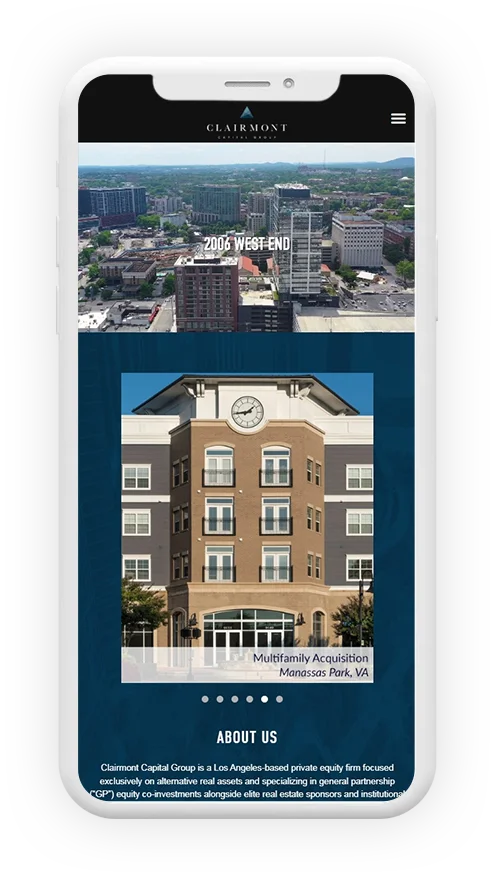
Clairmont Capital Group, a Los Angeles-based private equity firm, needed a digital strategy that highlighted their expertise in alternative real assets and GP equity co-investments. We worked on creating a brand identity that conveyed professionalism and trust, while the UI/UX design was focused on simplicity and ease of use. The website was designed to clearly showcase Clairmont's investment approach and niche focus on sectors like Student Housing, Senior Housing, and Built-to-Rent Single Family, making it a go-to resource for potential real estate partners and institutional investors.
Clairmont's audience includes real estate sponsors, institutional investors, and high-net-worth individuals in the US, UK, and Europe, all seeking strategic investments in alternative real assets such as Student Housing, Multifamily, and Industrial sectors.
Clairmont needed a fresh, cohesive online presence that effectively communicated their expertise and niche focus. Their old website lacked the professional design and clear messaging needed to attract top-tier investors and partners. We were tasked with giving their brand and website the overhaul it needed to make an impact.
The project, from planning to the website launch, took about 12 weeks. This timeline allowed for in-depth consultation, design refinements, and testing to ensure the best results for Clairmont’s digital transformation.

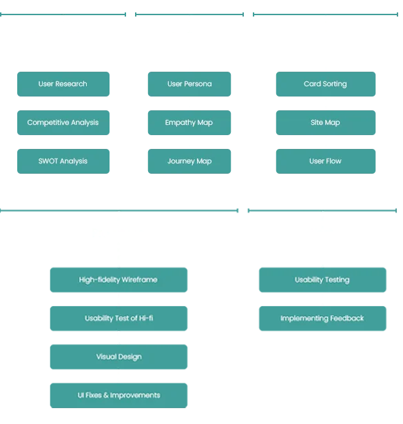

Our first step was to elevate Clairmont’s branding, creating a modern and sophisticated visual identity that aligned with their investment focus. We then designed a clean, straightforward website that makes it easy for visitors to understand Clairmont’s expertise in GP equity co-investments and market-inelastic sectors. The site’s design and layout ensure that users can easily find the information they need, whether they’re looking for sector details, investment strategies, or partnership opportunities. We also made sure the site was optimized for mobile and desktop use to provide a seamless experience.
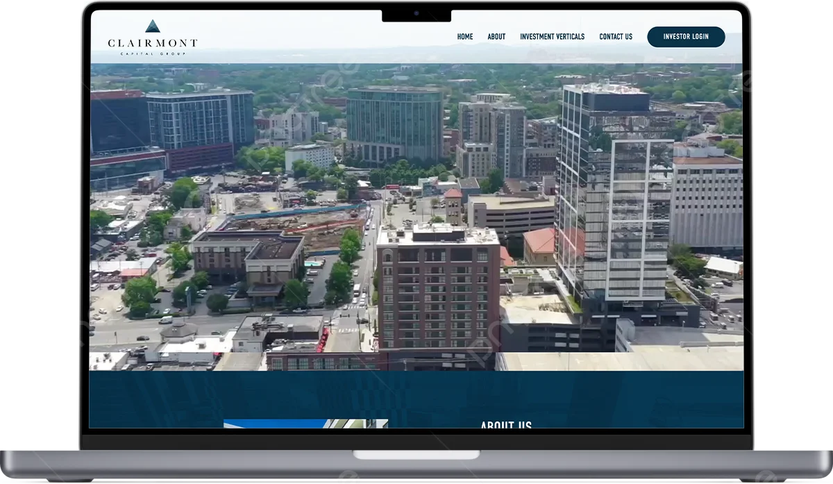
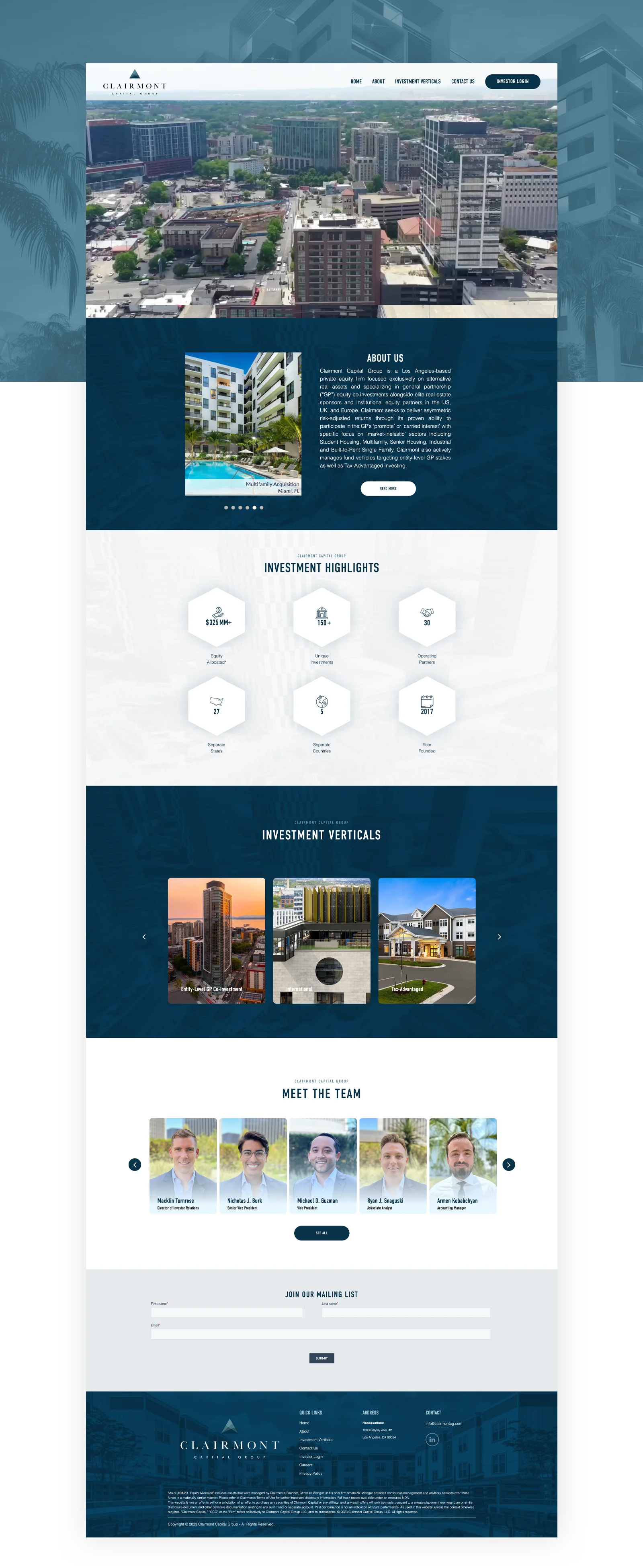
The homepage makes an immediate impact with a clear, professional look that emphasizes Clairmont’s areas of expertise. Key sections highlight the firm’s focus on GP equity co-investments, as well as their experience in niche sectors like Student Housing and Senior Housing.
The design uses clean visuals and simple navigation, ensuring visitors can quickly find what they’re looking for, whether that’s learning more about Clairmont’s services or getting in touch to discuss partnerships. The homepage is designed to build trust and demonstrate Clairmont’s unique value in the real estate investment world.

Like most HOA Board Management Website, mobile dominates their customer base. We made mobile our first priority, ensuring that the browsing & shopping experience was effortless.
