All Season Digital


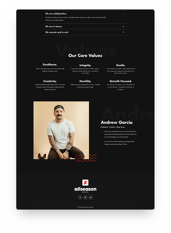
When they approached us, AllSeason's website did not reflect the creativity that they wished to promote in their design. There was a lack of appeal and the navigation of the site was unclear and confusing. We made sure to revamp the corporate look of the website to give it a modern and more visually attractive look that would properly convey what their company represents.

We included vibrant videos, a stark contrast in design, and clear and concise content for the services that they provided. We made sure to make the website visually appealing and straight to the point so the focus would be to have clients contact the company directly to book services. We showcased past works that the company did so that new clients could have a clear idea of what the company is capable of.